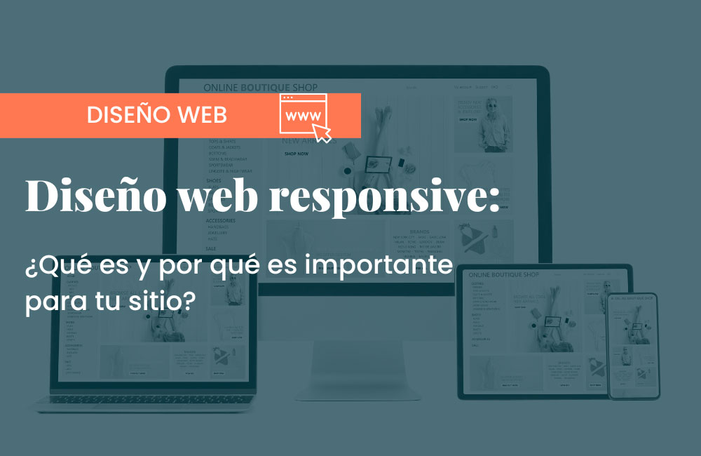
If you have a website or are considering having one, you’ve probably heard the term “responsive web design” many times. However, do you really know what responsive web design is and why it’s so important for your business? In this article, we’ll explain everything you need to know about it and how it can help improve user experience, SEO, and conversion on your website.
What is responsive web design?
Responsive web design is a design that adapts to different screen sizes, from desktop computers to mobile devices like smartphones and tablets. This means that the content, structure, and elements of your website adjust automatically to the width of the screen of the device being used.
For example, if you have an image that spans the entire screen on a desktop, on a smartphone, it will adjust to fit the screen size and display correctly. Likewise, the text size, menu, and buttons will adjust so they are readable and accessible on any device.
Why is responsive web design important?
It is important for several reasons:
- Improves user experience
When users access a website from their mobile device, they expect to find an adapted version that allows them to navigate and find what they need easily. If the website is not adapted, it becomes difficult to navigate, page load is slow, and information is hard to find. This can lead to a bad user experience and early abandonment of the site.
With a responsive web design, users can enjoy an optimized experience, regardless of the device they use. This means navigation will be easier, information will be more accessible, and the site will be generally easier to use.
- Improves SEO
Responsive web design is an important factor in SEO (Search Engine Optimization). Since 2015, Google has updated its algorithm to prioritize websites with responsive web design. This means that if your website is not adapted to different screen sizes, it may not appear in the top search results on Google.
By having an adaptive design, search engines can properly index all the pages of your website and present them in search results correctly. Additionally, Google rewards websites that offer a good user experience, which can improve your ranking in search results.
- Increases conversion and leads
A responsive web design can also help increase the conversion and leads on your website. When users can easily navigate your website and find what they need, they are more likely to convert into potential or actual customers. Additionally, a well-designed, easy-to-use site can improve your brand’s reputation and increase user trust in your company.
- Prepares your website for the future
With the rapid advancement of technology, it is difficult to know which devices and screen sizes will be popular in the future. With a responsive design, your website will be ready for any device that emerges in the future, meaning you won’t have to redesign it every time a new device comes out.
Moreover, it is easier to maintain than a separate design for each device, which can save time and money in the long run.
- Improves branding
First impressions matter a lot. If a user tries to access your website from their mobile device and doesn’t have a satisfactory experience, they will get the impression that your brand is outdated and that your company doesn’t care about customer satisfaction. On the other hand, a responsive, modern site with good usability will create a positive impression that will naturally “transfer” to your products and services.
Key elements for a quality responsive web design
Now that we have a clear understanding of what responsive design is, and that it’s an essential practice for ensuring a page adapts to any device and provides an optimal user experience, it’s crucial to consider a variety of factors, including image and video size and proportion, usability on touch screens, optimized load times, and both vertical and horizontal design formats. Let’s explore them below:
Typography adapted to each screen
Typography is essential on any page as reading is the primary activity on most sites. Therefore, it is necessary to adapt font size to each screen so that text is legible without zooming in. Consider the screen width and avoid using columns with fixed sizes. Additionally, it’s crucial to choose an appropriate font family to ensure readability.
Proportional images and videos
Images and videos are visual elements that add value to the page and can make the difference between an attractive and a mediocre design. It’s important that they adapt to the user’s screen so they can be comfortably viewed. The proportion of the image and the device on which it will be displayed should be considered.
Vertical or horizontal format
Vertical or horizontal format is a fundamental element to consider when designing a responsive website. Mobile users typically prefer the vertical format because it’s more comfortable and natural for interacting with the touch screen. However, it’s important to remember that in some cases, such as viewing a video, the horizontal format might be more comfortable.
Usability on mobile devices
Usability is another key factor to consider when designing a responsive website. Mobile and tablet users interact with the page through a touch screen, while on desktops, interaction is done using a mouse. Therefore, it’s essential that menus, buttons, and other elements are designed to offer a good user experience in both cases.
Optimized load times
Optimizing load times is crucial to ensure a satisfactory user experience on any device. Mobile and tablet users typically have more limited connections than desktop users, so reducing page weight and optimizing load times will help improve page performance.
Device-adapted effects
Visual effects, such as hover effects, can be very useful for enhancing the user experience, but it’s necessary to consider that they do not function the same way across all devices. For example, hover works on desktop computers but not on mobile devices. Therefore, adapting visual effects to each device is key to ensuring a satisfactory user experience in all cases.
How to implement responsive design on your website

Once the basics of responsive design are understood and the elements to be adapted are considered, it’s important to know how to implement this design type on your site. Below are some key points for doing so:
- Use a framework: A framework like Bootstrap or Foundation is a tool that allows you to create a responsive site quickly and easily, as they offer predefined elements that can be adapted to your site’s needs. Utilize media queries: Media queries are a CSS tool that lets you adapt your site’s design to different screen sizes. With them, you can define different styles for each screen size and automatically adjust the page.
- Optimize images: As we’ve seen, images are a key element in responsive design. It’s valuable to optimize their size and weight so they don’t negatively affect page load. You can also use tools to adapt images to different screen sizes.
- Care for form design: Forms are another key element in responsive design. These are often how users communicate with a company. It’s important that forms adapt to different screen sizes and are easy to use. Using form labels, input fields, and buttons that adjust to the screen width is recommended.
- Simplify the navigation menu: The navigation menu is one of the most important elements of a website as it allows users to easily find the information they need. It’s recommended to simplify the menu in responsive design so it’s easier to use on mobile devices. You can use a dropdown menu or a hamburger menu.
- Test the site on different devices: Once the responsive design is implemented, it’s important to test it on various devices to ensure it adapts correctly. You can use tools like Google Chrome DevTools to simulate different screen sizes and check how your site looks on each of them.


