
Have you ever experienced that when working on or designing a document, the color changes once printed? This happens because in both the digital and print worlds, there are two main color systems, with the most commonly used being RGB and CMYK. But what’s the difference between them? Choosing the right colors will help convey your message, make your project stand out, and have the desired impact on your audience. In this article, we share the differences and what you should consider when choosing the color model for any design or project.
Differences Between CMYK and RGB
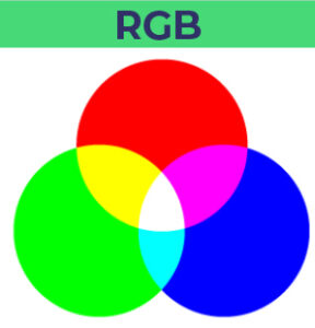 The RGB Code uses three primary colors, based on the addition of primary colors. When all colors are mixed, it results in pure black or white. The meaning of this code is as follows:
RGB = Red (Rojo), Green (Verde), Blue (Azul).
These colors are created by adjusting the intensity of each color in a range from 0 to 255.
Why Do Colors Look Brighter on Screen?
Your screen mixes red, green, and blue light to produce bright colors. It represents the colors used in screens such as computers, mobiles, tablets, etc. Colors are brighter, and it is not the same brightness of a screen compared to a printed material, which is usually opaque. That’s why this code should only be used for digital designs or projects, such as websites, applications, banners, email marketing, social media posts, etc.
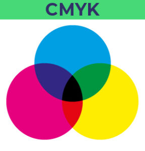 The CMYK color mode, also known as four-color printing or process color, is based on subtracting white and mixing the four colors to produce various shades. This is why it’s crucial to configure the file in CMYK mode before printing so the final result is as expected.
CMYK = Cyan (Cian), Magenta (Magenta), Yellow (Amarillo), and Key (Negro). It is used for printed designs.
It should be used for color photos or graphics that need to be printed, such as business cards, stationery, illustrations, labels, posters, and any other printed design. It’s a subtractive color model, and the color is obtained by adjusting the brightness of each tone. Offset printing presses print using these four colors, as well as special flat inks, meaning the printing process is CMYK. This type of printing is the most common and the best for large batches, such as 600 postcards or more, and it produces sharp and clear prints.
Keep in mind that shades may slightly vary depending on the paper weight, printer calibration, the tone of the paper, etc.
Tips for Changing These Values in Adobe Programs
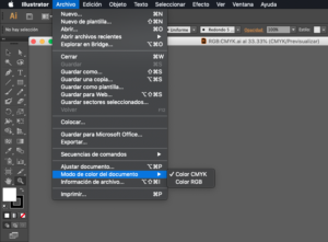
Illustrator
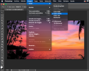
- Change the color in your designs: File > Document Color Mode > Color CMYK/RGB
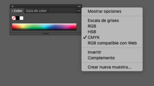
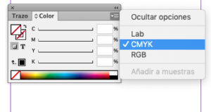
- Open from the color window: Window > Color > Upper right corner > Choose Mode
Photoshop
Before configuring any photos, you must set the default workspace in the program. To convert your photos to CMYK in Photoshop, configure the following:
- Click Image > Mode > Color CMYK.
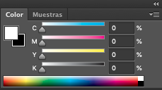
- Modify the color from the bar: Window > Color > Click on the upper right bar
Indesign
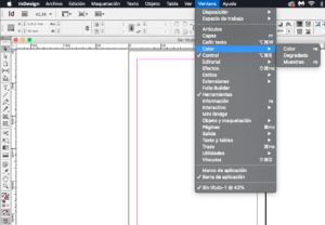
- Change the color mode in InDesign: Click Window > Color > Then click the drop-down button in the upper right corner and select CMYK.
Differences Between CMYK and RGB with a Pantone Color (PMS)
The meaning refers to the company that created it, Pantone (Pantone Matching System), which has over 1,100 colors with a unique number followed by a letter. Unlike the RGB and CMYK modes, it is typically called flat ink or solid color.
For manufacturers, the numbers are very important as they allow them to create a Pantone color and match the colors without direct contact between them.
The PMS system is used to correctly match and align materials with their corresponding RGB or CMYK colors and can be used to match a variety of colors, materials, fabrics, paints, and printed materials.
What Are They Used For?
These colors are the most commonly used in corporate design and logo creation. Pantone colors are created using 15 base pigments, including black and white, so they are hard to replicate using CMYK. If you’re going to print a file, you should explain the color to the printer precisely.
5 Tips to Avoid Printing Problems
Knowing the differences between color profiles will help you understand how the different printing processes work and how those processes can affect the final result of a project. Here are 5 tips to avoid printing problems:
- Before sending the final file to print, it’s important to check that the file is in CMYK mode. If this modification is not made, your printer will make the change automatically.
- If possible, you should request a proof print to verify shades before printing the whole batch or files.
- Always keep in mind that the color will change on screen once printed.
- Do not use an RGB, CMYK, or indexed color as Flat Ink, as they need to match the Pantone system to be printed.
- Don’t forget that a good option for low-volume printing projects and/or extremely short delivery times is digital printing, as it can use RGB or CMYK, and although the prints are not considered as “sharp” as offset printing, digital printing can produce great results.
Knowing how color palettes work is key for any graphic design project. At Dos Setenta, we have a team of graphic designers specialized in creating corporate and advertising design pieces. We manage to create designs based on the values, history, and mission of companies, always delivering results tailored to each client.
You can also visit our graphic design page, where you’ll find detailed information about this service.