
Logo, isotype, imagotype, and isologo — these terms often cause confusion since they share some common elements, especially when referring to the visual representation of a brand. It’s important that not only designers but also clients understand the differences, as this makes it easier to define what their brand needs and how it will be used in the future. Below, we explain the differences. Let’s get started!
What is a Logo?
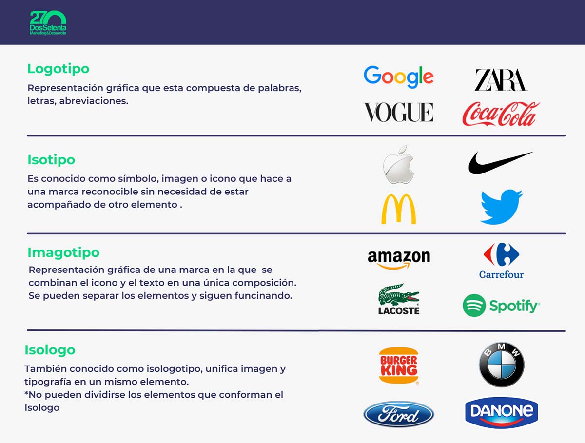
A logo is a graphic representation composed of words. According to the RAE, it’s a distinctive graphic symbol of a company, event, brand, or product. When creating one, different fonts and colors can be used as long as there are no other elements such as icons or symbols included.
A logo doesn’t necessarily have to include the full name of the brand or company; abbreviations, initials, or whatever best fits the corporate identity can be used.
Examples you can easily recognize: Zara, Google, Coca-Cola.

What characteristics should a logo have?
Now that we know what a logo is, it’s important to understand its characteristics beyond aesthetics:
- Simplicity: It shouldn’t include too many visual elements — the simpler, the better.
- Legible typography: It should be clear and readable regardless of the logo’s size.
- Color: Associated with the brand or identity manual.
- Memorable: It should be unique and stand out from competitors while maintaining the main message.
- Durability: Think long-term. Even as trends change, avoid constantly redesigning the logo.
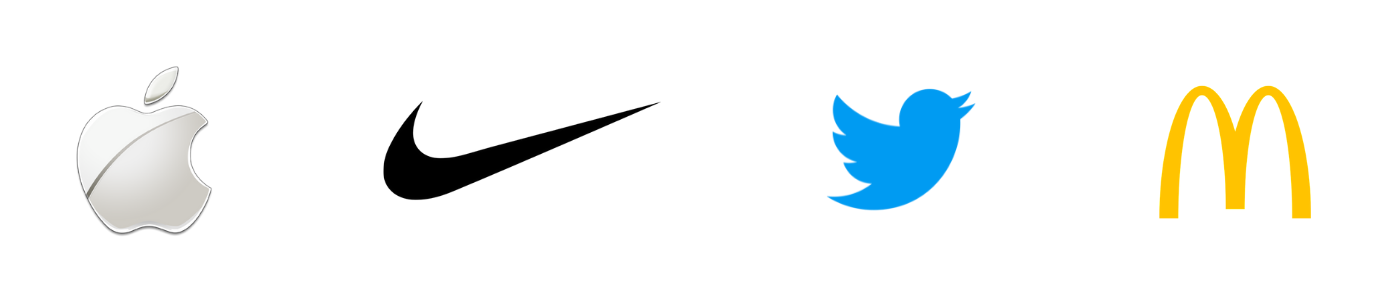
What is an Isotype?
An isotype is the graphic representation of a brand made up of a symbol, image, or icon that makes a brand recognizable without needing any other element. In this case, it cannot be read since there’s no typography, and the goal is for users to visually identify the brand.
Successful examples: Nike, Apple, McDonald’s, Twitter
What is an Imagotype?
An imagotype is the combination of a logo and an isotype. Therefore, the graphic representation of the brand includes icons and words. Most brands use both elements, and their corporate identity works both together and separately.
- Logo + Isotype.
Examples: Amazon, Carrefour, Lacoste, Spotify

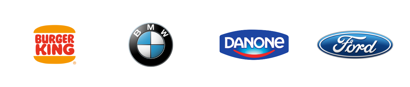
What is an Isologo?
Finally, an isologo is a visual representation that combines typography with an image and/or symbol, where the elements should not be separated because they lose their meaning.
- Typography + icon/symbol/image.
Some examples: Burger King, BMW, Danone, Ford, Starbucks.
Which is the best option for a brand?
- Study the company/brand, competition, sector, and market in depth to avoid a design that resembles another brand.
- Choose a typography that’s legible across different formats.
- Use a color palette that aligns with the brand manual and make sure it looks good in RGB and CMYK formats.
- Have your design in curves and PNG.
- Create a brand identity manual.
Differences between Isotype, Logo, Imagotype, and Isologo
Infographic examples: Logo, Imagotype, Isologo, and Isotype:
Now that you know more about the differences between logo, isotype, imagotype, and isologo — do you know which type of logo you’re using?
Make your brand stand out!
Ready to take your brand to the next level? At Dos Setenta, we’ll help you create the logo for your company based on your corporate identity. We design unique creations built from your company’s values, history, and mission, offering results tailored to each client that truly convey your brand’s essence.